Complete redesign of the Vibrol website for desktop, tablet and mobile users.
Once the Google Analytics started telling a story of mobile users outweighing desktop views we reacted accordingly.
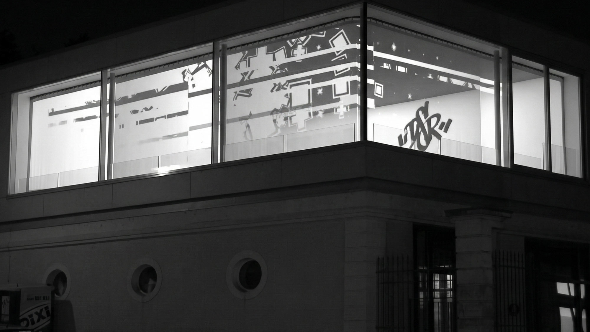
The website was designed from the ground up to be reactive with all devices. We transitioned to a high-performance single-page architecture, ensuring users could access all vital information through intuitive scrolling. For returning desktop users, I maintained a robust, traditional menu to ensure navigation remained flexible and familiar. With my motion graphics background I developed a custom looping header animation. This serves as a dynamic focal point, designed to capture visitor attention instantly and reduce bounce rates the moment the page loads.
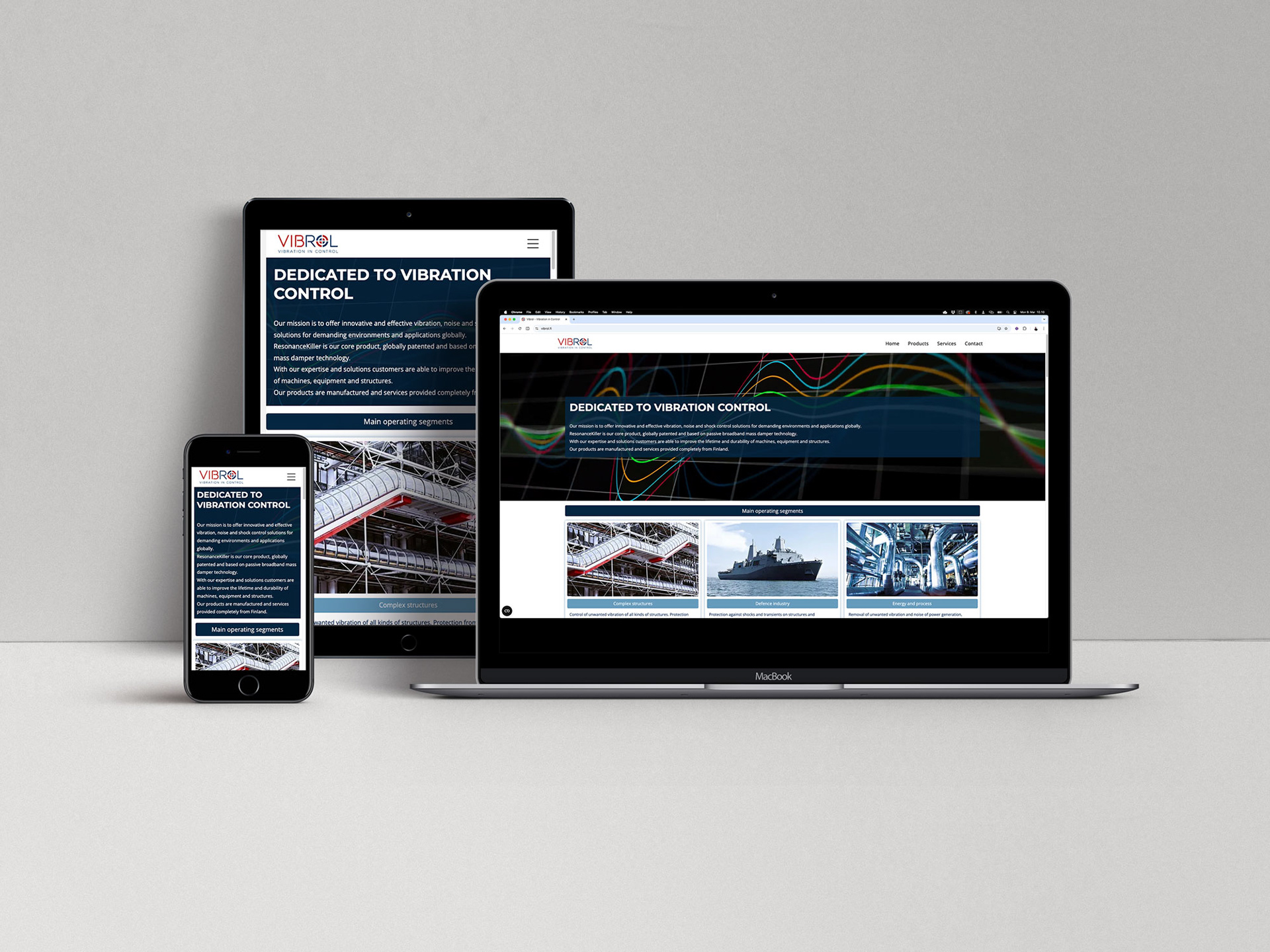
Website is responsive to desktop, tablet and mobile.

Still frame of the header animation created in After Effects
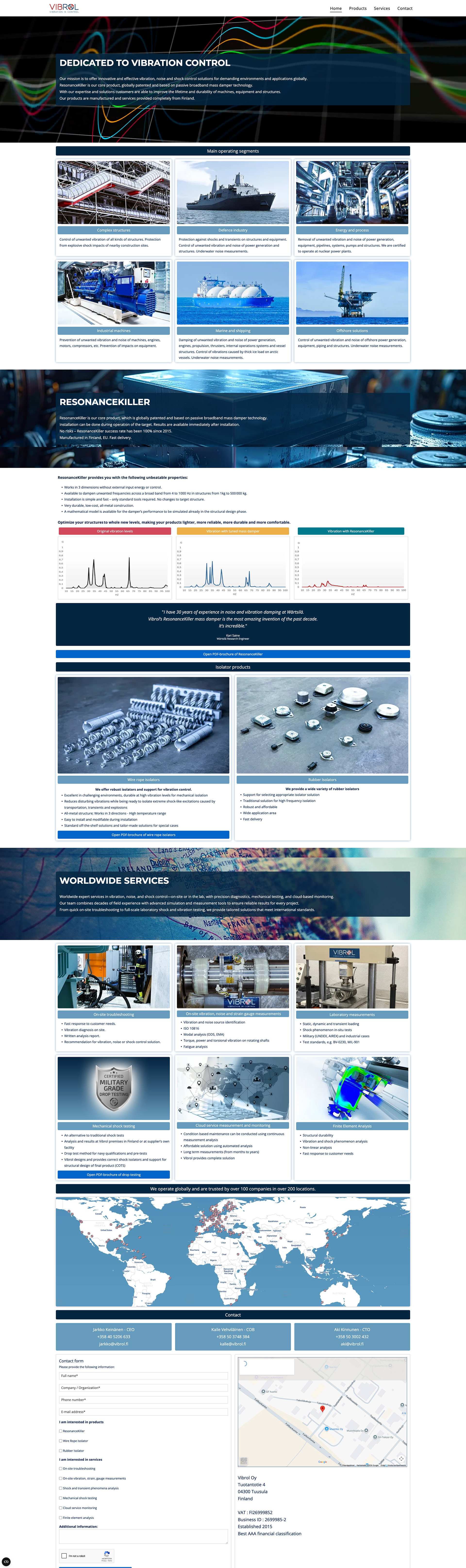
Desktop view